Helping Crossfitters Track their Progress
Usability Case Study | iOS app
Wodify is a platform that helps gym owners manage their business and lets members track their performance.
THE CHALLENGE
People only use half the app because it’s difficult and confusing to navigate.
SOLUTION
Design an experience that feels easy for users to add results and see past workouts while in the gym.
ROLE
Product Designer. Conducted user research and testing sessions, ideation, interaction, and visual design. I am in no way affiliated with Wodify.
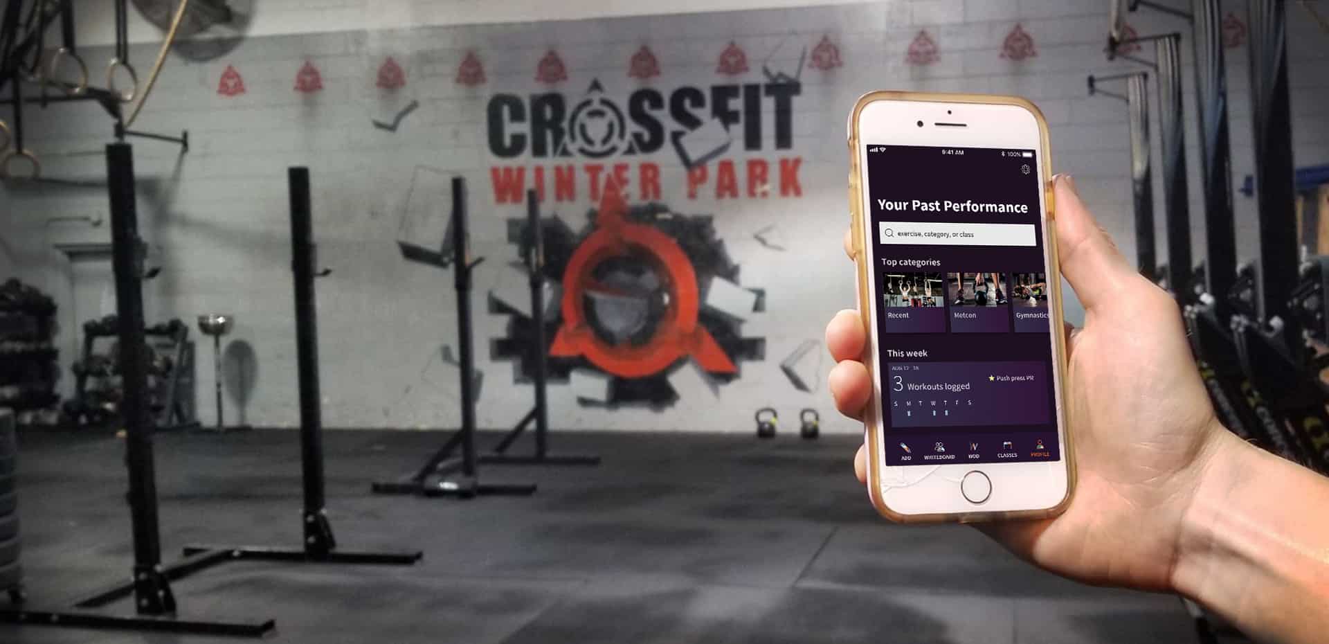
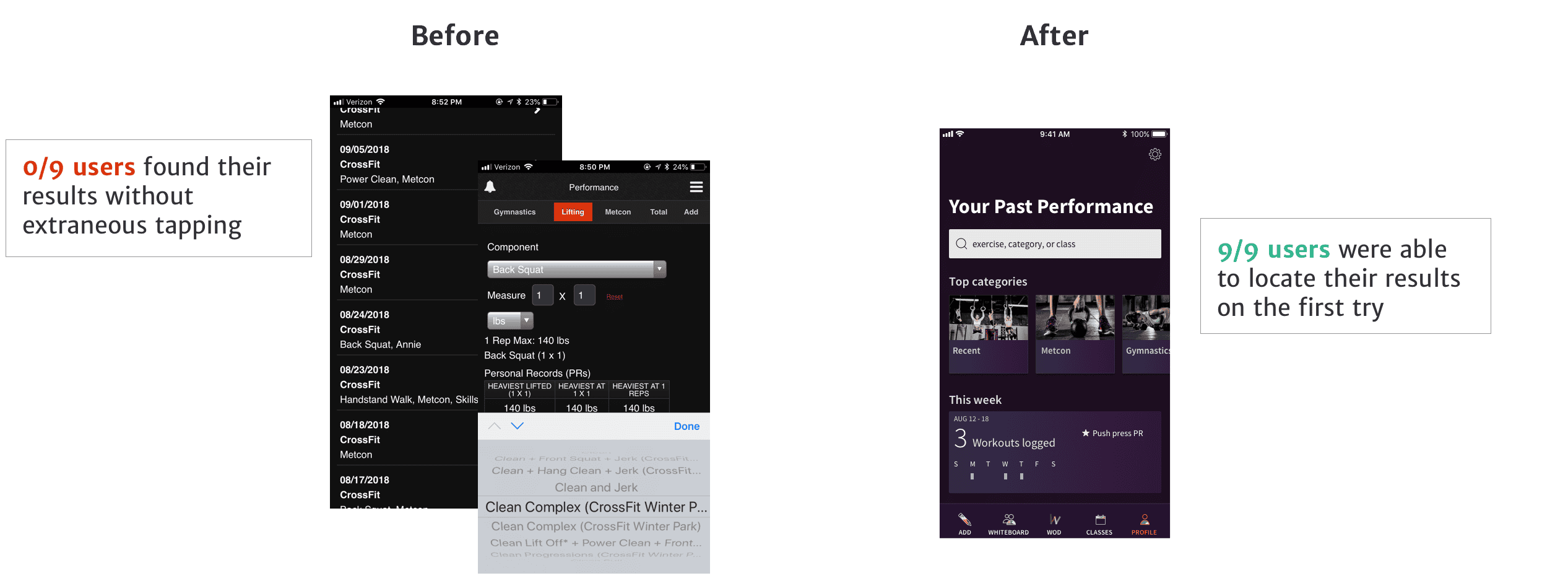
Results: Find & Search for Any Exercise
Based on user research, I found that people really wanted to see their previous workout history, but logging a workout in the first place was too annoying. The way I redesigned the Add Workout flow meant it would be findable again at a granular level.
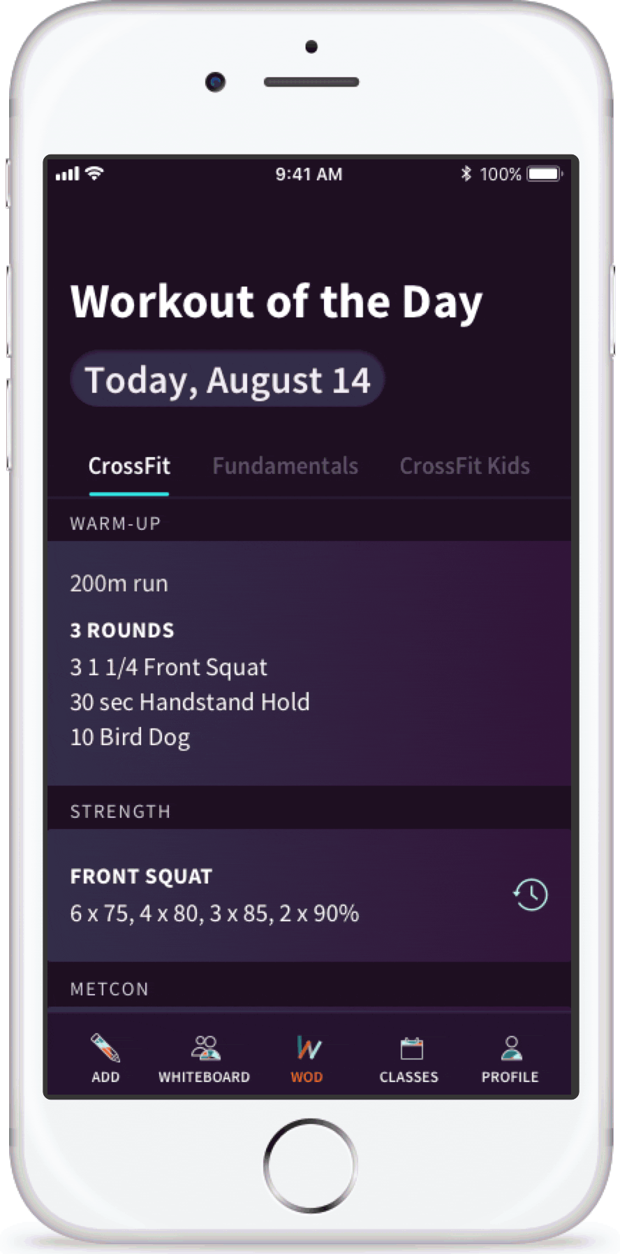
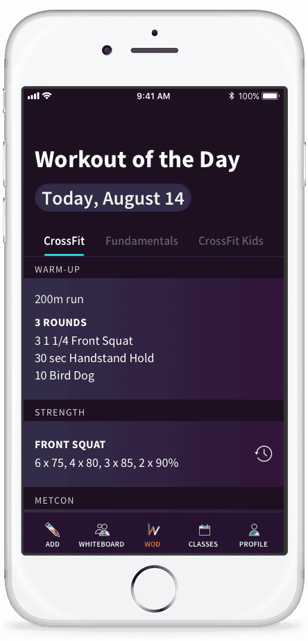
Add Workout Flow
Before: Two different locations to enter different results.
After: Add any type of workout through the same flow.
Search for Anything

Before: Results could be found in two separate sections only scrolling by date or dropdown menus.
After: Past performances are integrated and can be found through a search bar.
Tab Bar Menu
Before: 9 menu items in a slide-out side bar, many of which users did not interact with.
After: A visible menu ties the flow of the app together.
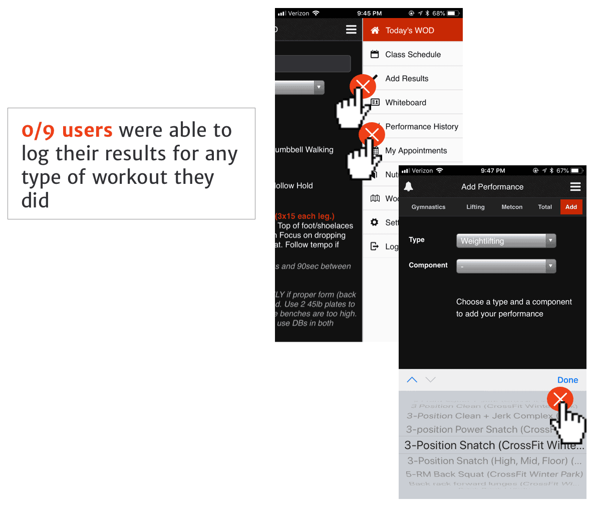
Validation Testing
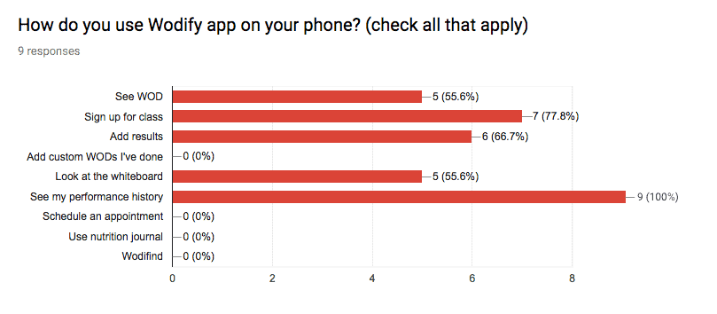
I tested my redesign with 9 users to make sure I was solving their problem. After getting feedback on some of my early sketches, I was able to quickly iterate so that results would be easier to search.

How I Got There
Personas: Wodify users with a face
I interviewed 9 current users of the app, ages 21 to 41 years old, 4 men and 5 women. This is fairly representative of Wodify’s current user demographic: 63% of CrossFit participants are under 44, with 50/50 male-female representation.
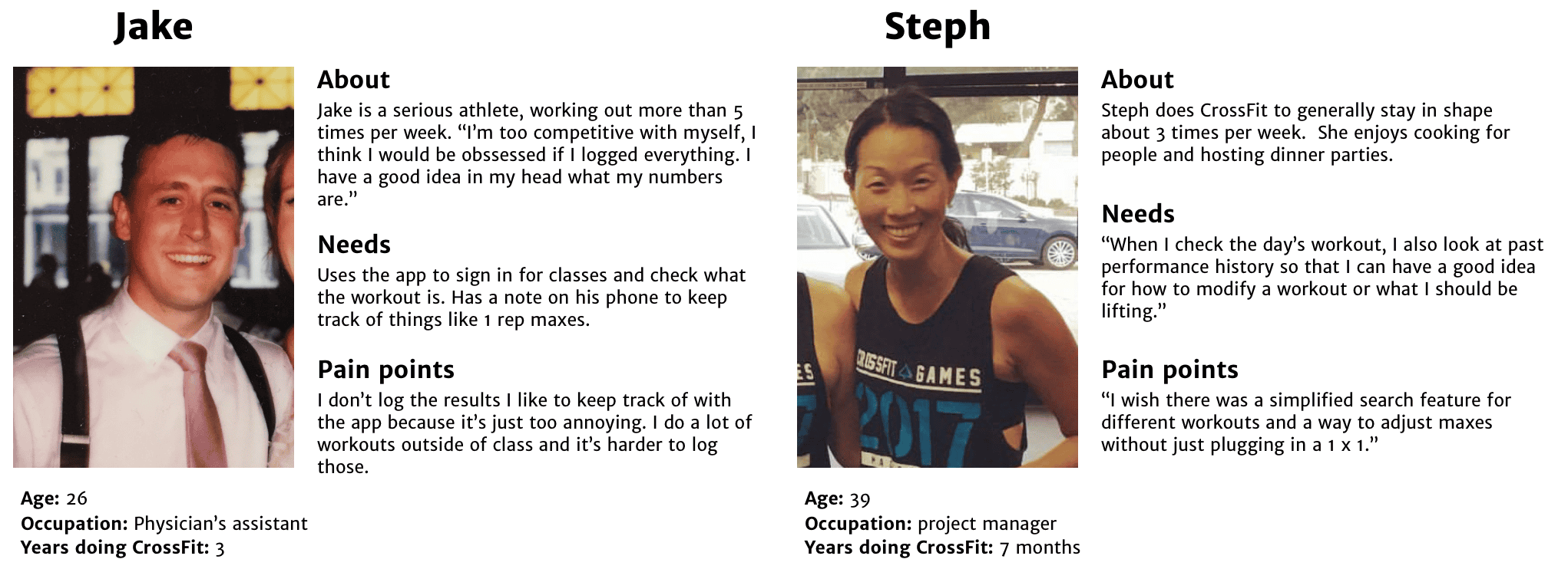
I wanted to design for users like Jake by making the app feel simple and engaging to navigate, so that adding something like a one-rep max would feel too easy not to use. And I wanted to deliver for users like Steph who are excited to see more and input results.
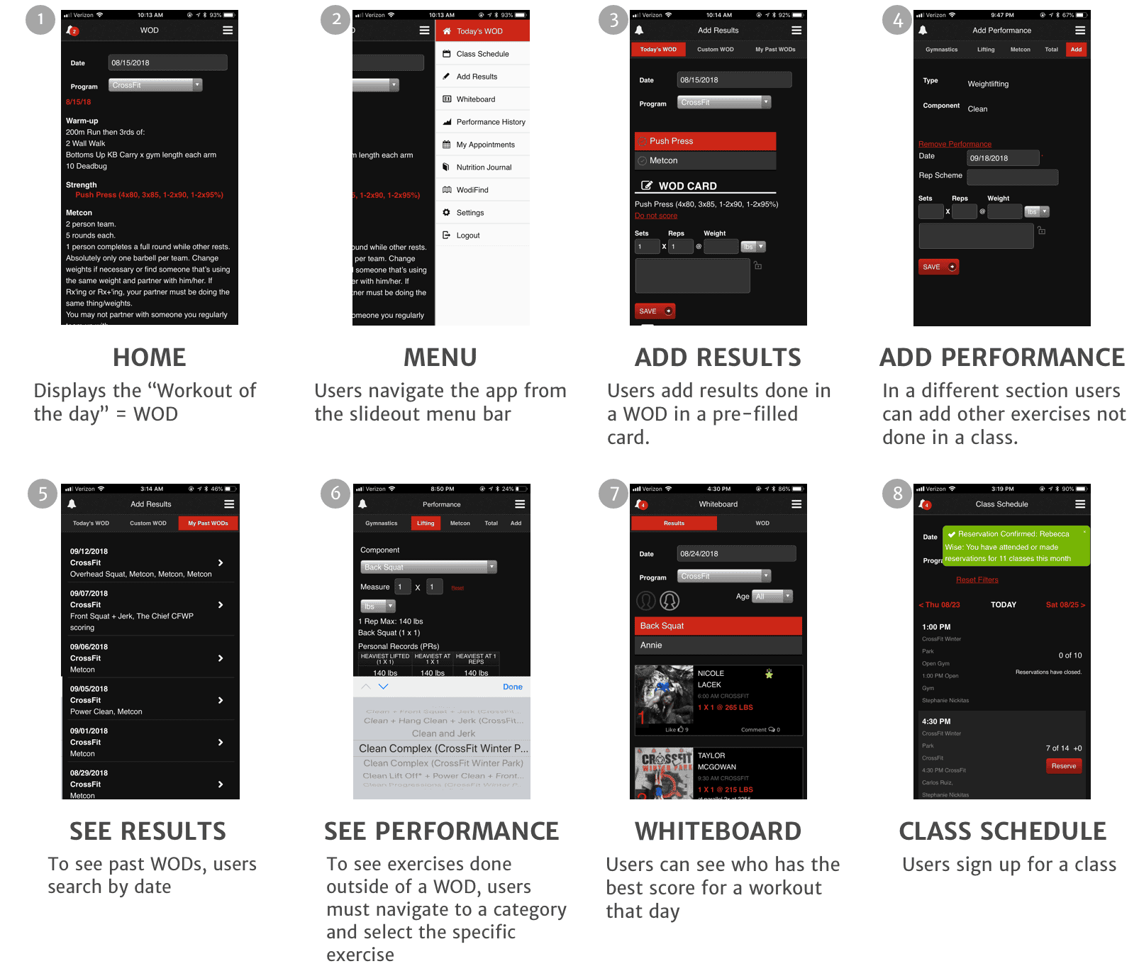
App Analysis
I took an in-depth look at each screen in the app to see its current features and how they connect to one another.
Defining the Problem
Paint Point #1: Recording Workouts Done Outside of Class
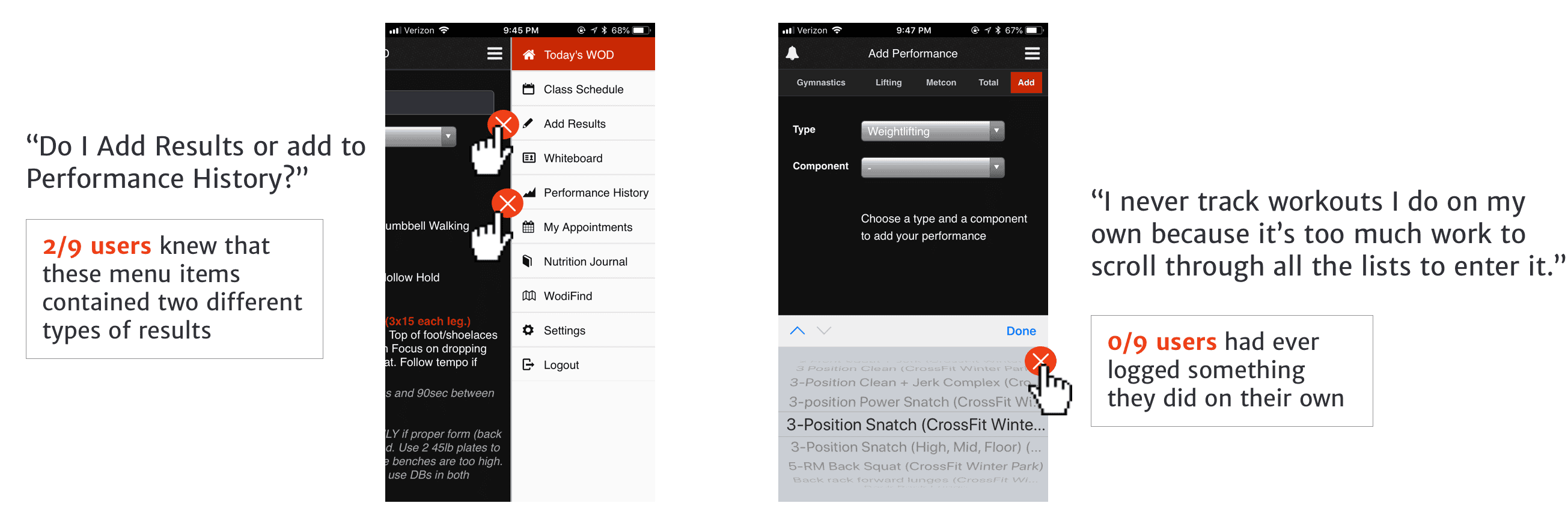
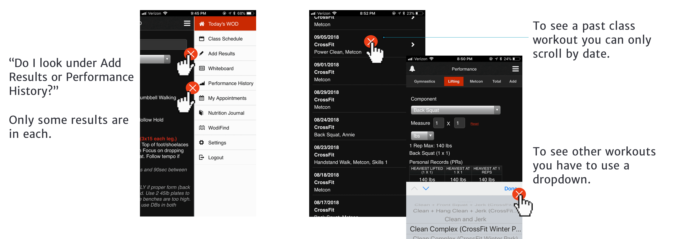
Paint Point #2: Finding Results
Paint Point #3: Too Many Options is Confusing

Ideate: the Redesign
Information Architecture
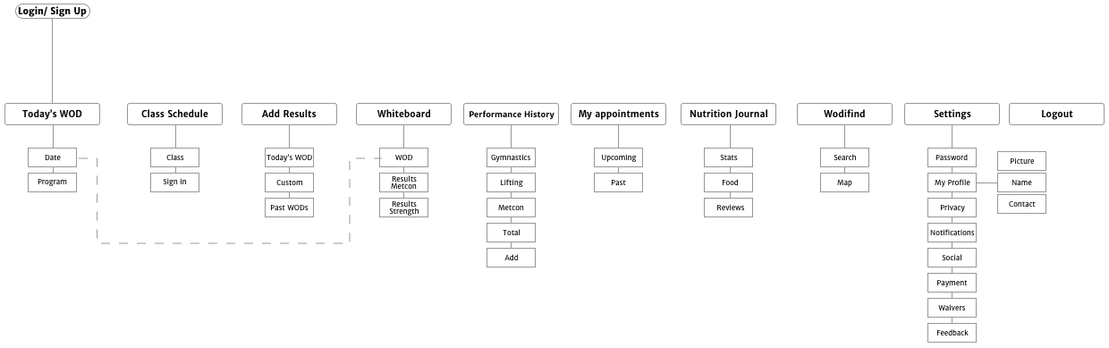
Current information architecture
In order to tie the ability to add workout results and search past workout results together, I restructured the IA to increase the visibility of key features, eliminating the ones users did not use, and improve navigation.
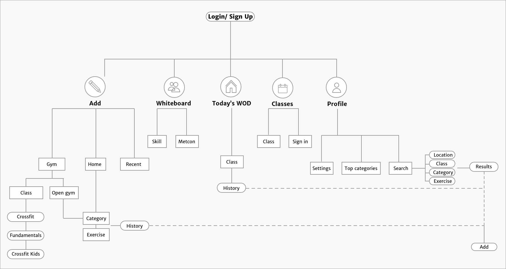
New information architecture
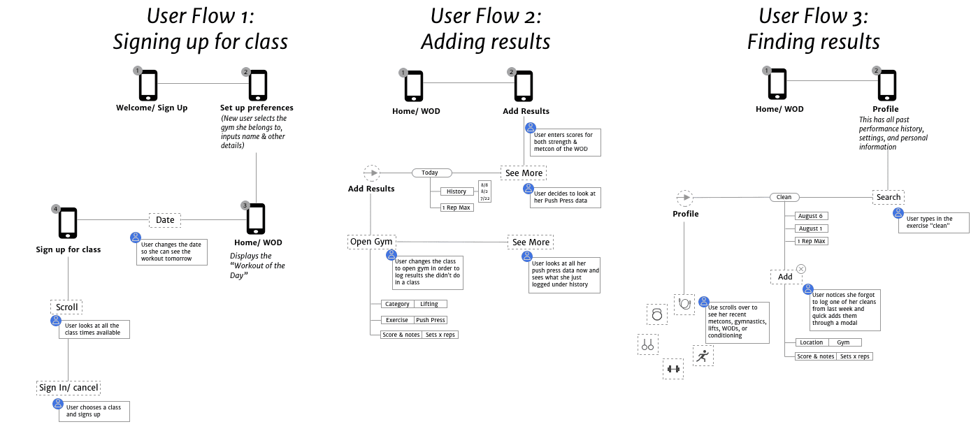
User Flow
As I thought through the best way to tie adding results and seeing past ones together, I focused on 3 key user flows:
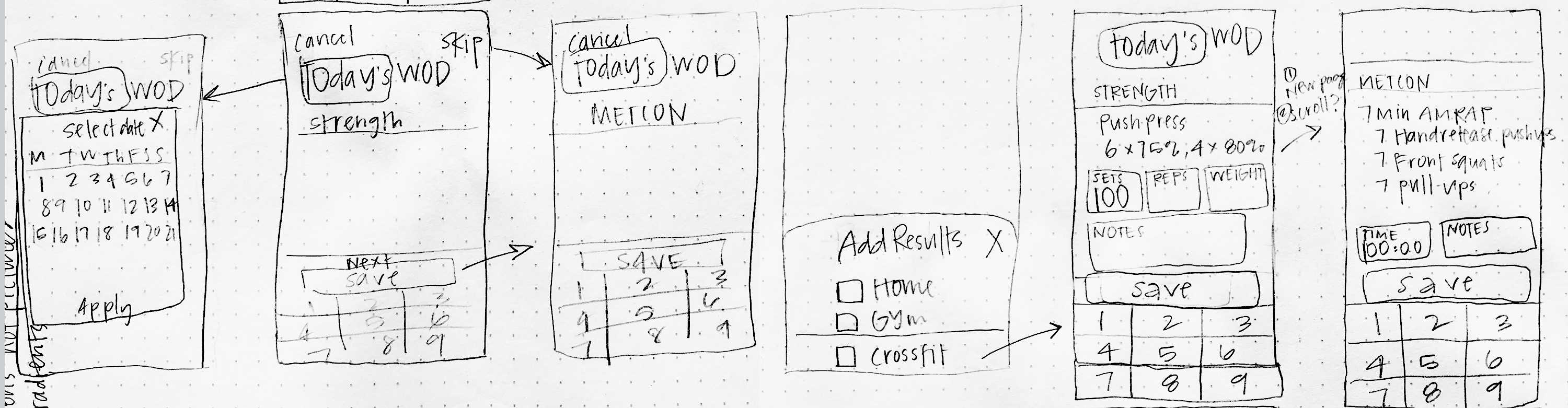
Sketches
I gathered some feedback on these early screens for Add Results and Find Results, and realized: there was no possibility for a comprehensive search feature of exercises from the way I had users add results.
In order for there to be a simple, ‘type-anything’ search bar, users must categorize their results more specifically.
How might users add results in the app from any type of workout without feeling like it’s too tedious to use?
Ideating on inputs
My goal was to create the least number of interactions needed from a user as possible. I sorted all possible locations, classes, categories, and exercises a user might do into various levels of distinction. This gave me a better understanding for what input fields were necessary at each stage to sort results.
I realized there might be potentially conflicting goals between users who just want to keep track of their progress any time they workout—whether at the gym or elsewhere, and gym owners need to know if their members are using the gym for a workout (so their membership can be charged). For this reason I added “Location” into the sorting process.
Visual design
I designed each visual touchpoint to follow consistency and create delight. I followed common interaction patterns that users are already familiar with to make for an intuitive user experience.

Prototyping & Validation
I tested the prototype with 5 users. Insights from this led me through further iterations. Below are the mockups of my final solutions:
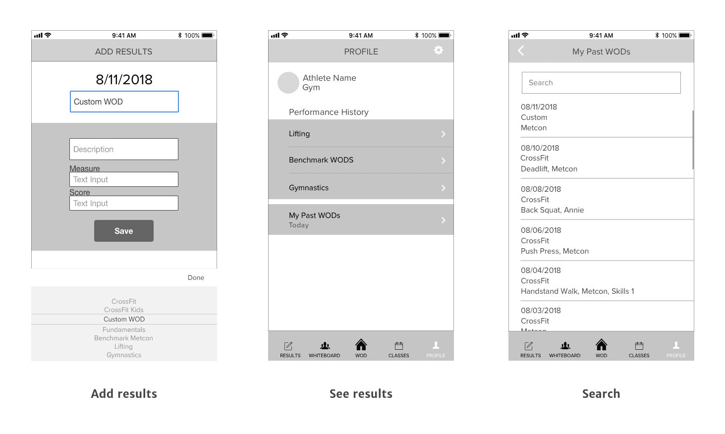
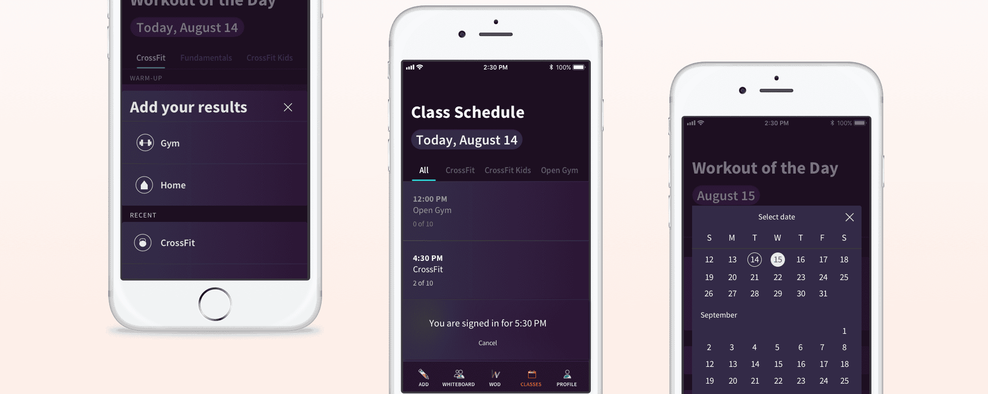
Adding Workouts in One Place
Before
After

Finding Results Through Search
Tab Bar
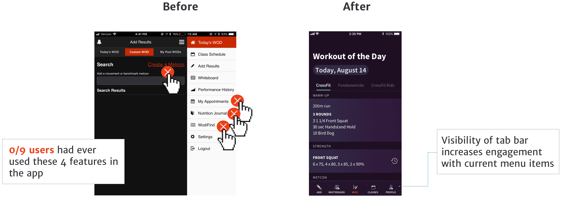
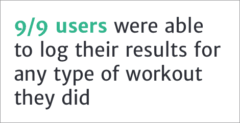
Here are the results of my redesign which I tested with 9 users: