Turning “I feel tricked,” into a Satisfying Purchase
Usability Case Study | iOS app
Paperless Post is a platform that lets users create and send online invitations to help people gather more easily in real life.
THE CHALLENGE
Premium defaults added to all free invitation designs are undiscoverable until the checkout page, where users are confused and quit the app.
SOLUTION
I believe that a more transparent value proposition for Premium options will reduce frustration during the design & send invitation flow for hosts, and lead to higher conversions into Premium features.
ROLE
Product Designer. Conducted user research and testing, problem definition, ideation, and interaction design. I am in no way affiliated with Paperless Post.
Results: Creating & Sending Invitations is Easier Than Ever
Based on user feedback, I surfaced premium options much earlier in the invitation design & send flow and presented their value in a compelling way. I added form controls to the edit invitation page, and clearer affordances for each step in the flow to improve the usability of the app for people wanting to quickly design and send out an invite.
Add Guests & Send Invite

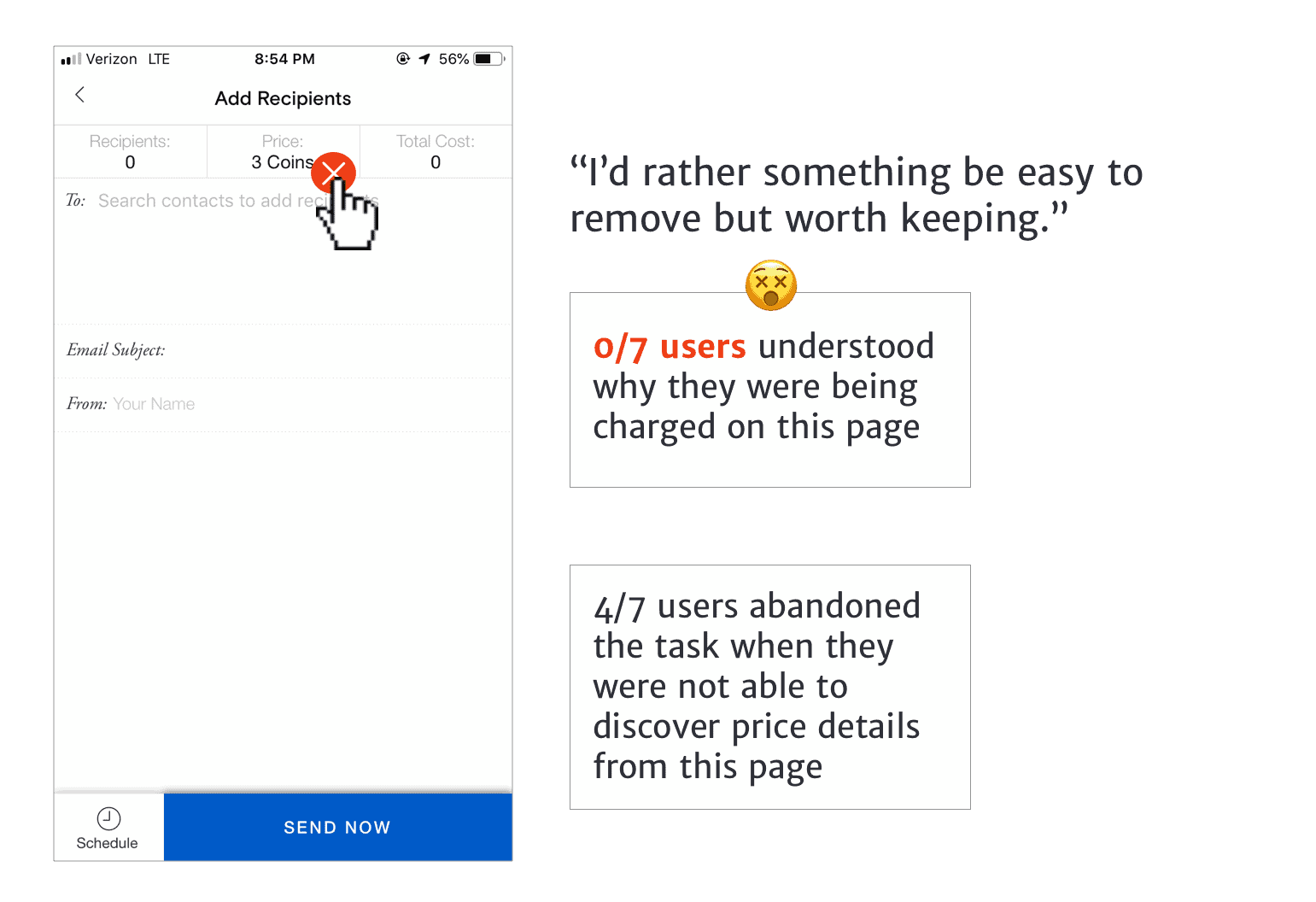
Before: Users quit when they saw a price for their “free” invitation and could not find what they were paying for or a way to adjust it.
After: Rearranged task flow to add premium options rather than have them as default, eliminating Price from this page if no premium options are selected.
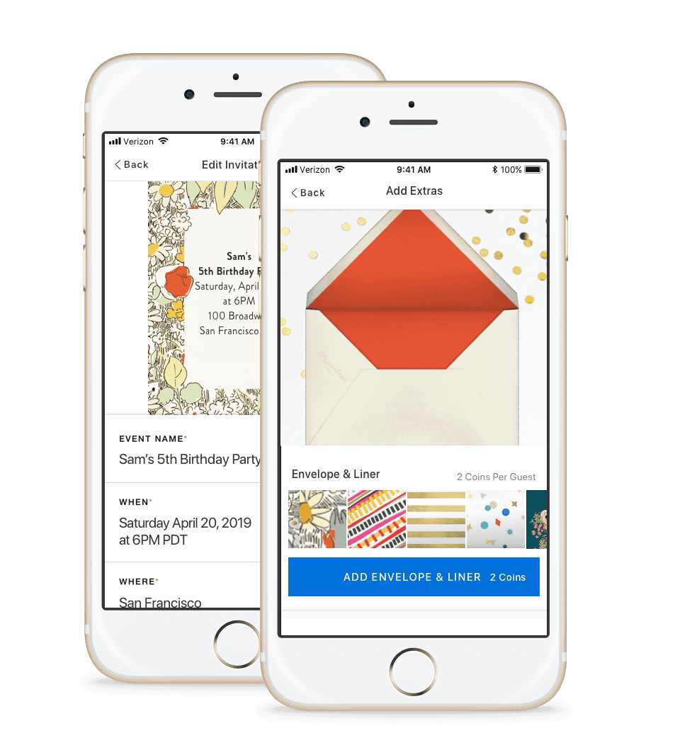
Presenting Premium Options
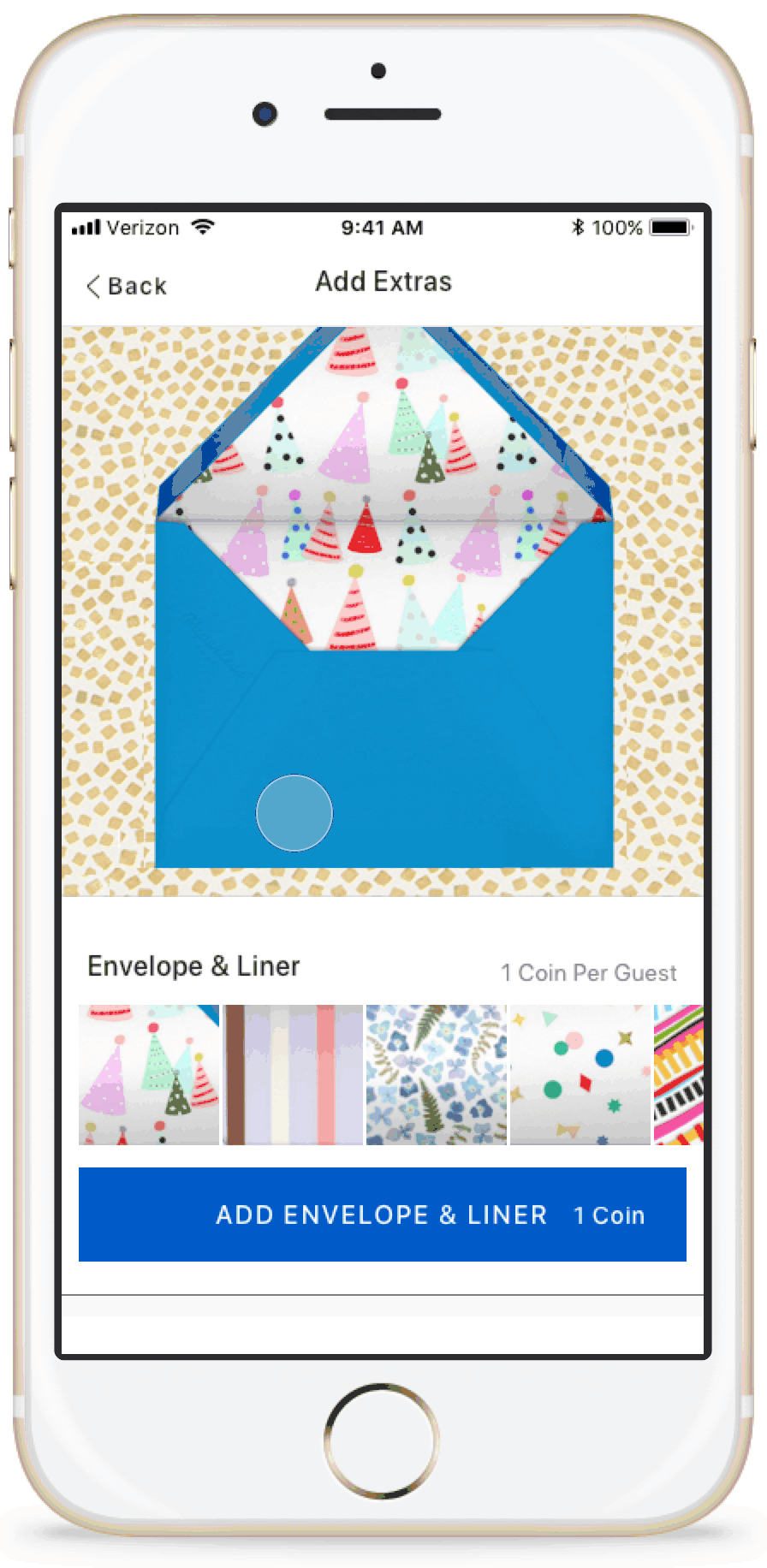
Before: Users were frustrated because they didn’t understand where the envelope, liner, and backdrop were located or why they were being charged.
After: Extras have their own screen in the flow.
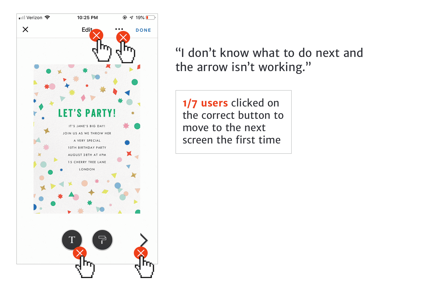
Edit Invitation

Before: Users were unsure of how to move to the next step, clicking into the wrong screens.
After: Rearranged task flow to have clearer affordances, fewer options, and text fields for the invitation design.
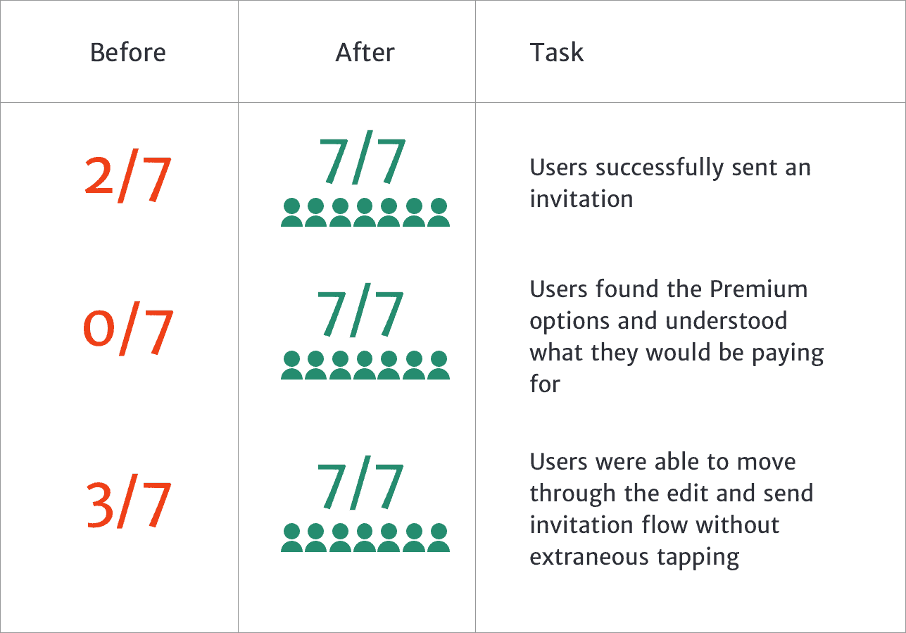
Validation Testing
I tested my solution with 7 users.
How I Got There
Getting to Know the Users
I made a provisional persona based on online research and my understanding of people who I knew used the Paperless Post app. In order to understand why people are using the app and how, I used Job Stories to expand the framework from which I approached thinking about the various motivations a person might have for using the app.

I conducted usability tests with 7 people to identify existing pain points in the app. I set out to find people who hosted an event at least a few times per year and multi-tasked while planning. I asked them to complete the following task:

Finding the Right Problem
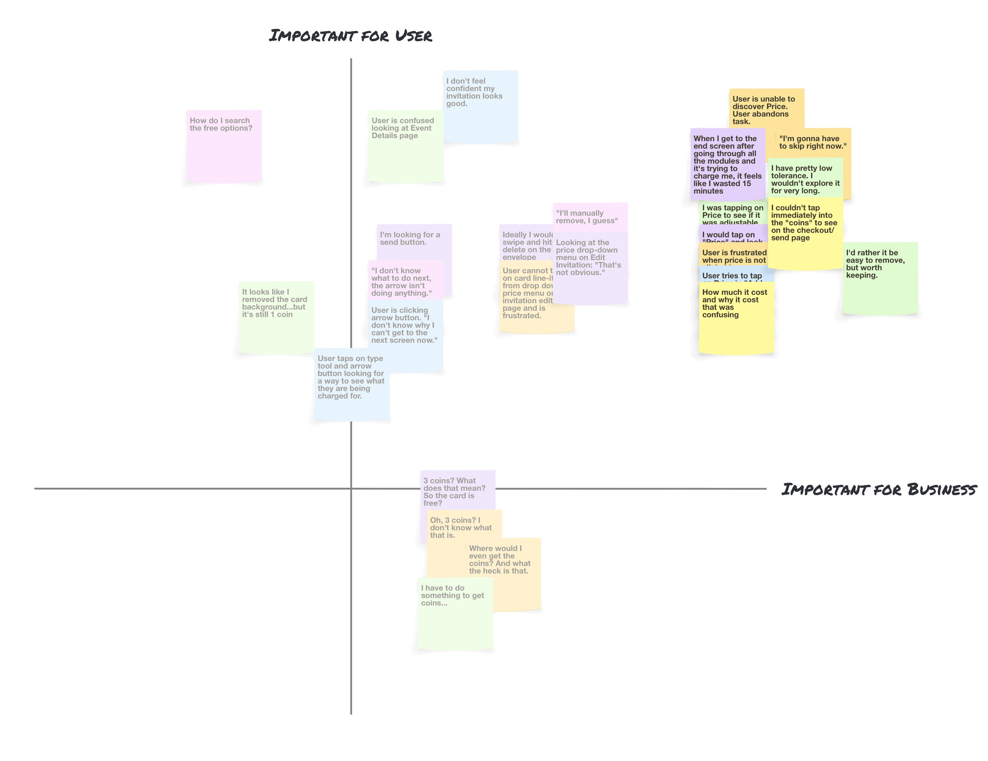
After reviewing the notes from the usability tests, I made an affinity map to synthesize my findings and I used a 2 x 2 to help prioritize pain points. This allowed me to better identify the scope of this project and choose things that would have maximum impact for both business and user. My assumptions of importance to users were based on my job stories and conversations with users. My assumptions of the importance to Paperless Post were based on research about their company and their business model.
“When I get to the end and they throw stuff in and it’s not free anymore, I’m gonna quit the app. It feels like they tricked me.” —User during a usability test
How might we reduce frustration in the checkout process for hosts creating free event invitations, while presenting the Premium options for hosts who would consider upgrading?
I audited the flow of how users discover the Premium default options before sending. I highlighted key screens which caused the most frustration:
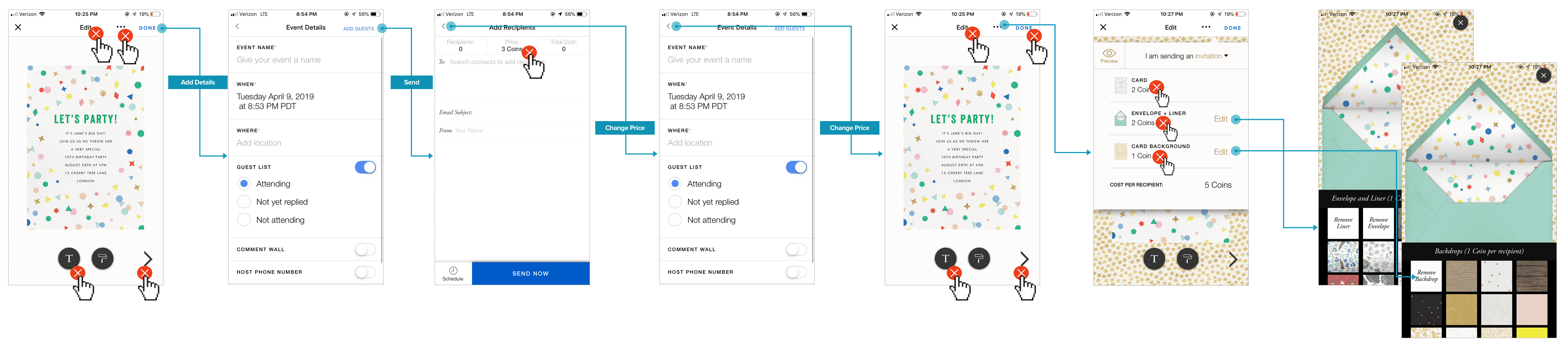
Defining the Pain Points
Pain Point #1: “Price” on Add Guests & Send Screen
Pain Point #2: Discovering Premium Details

Pain Point #3: Edit Invitation
Task Flow
I made a task flow to illustrate how users currently navigate through the app to send out an invitation and discover the pricing menu:
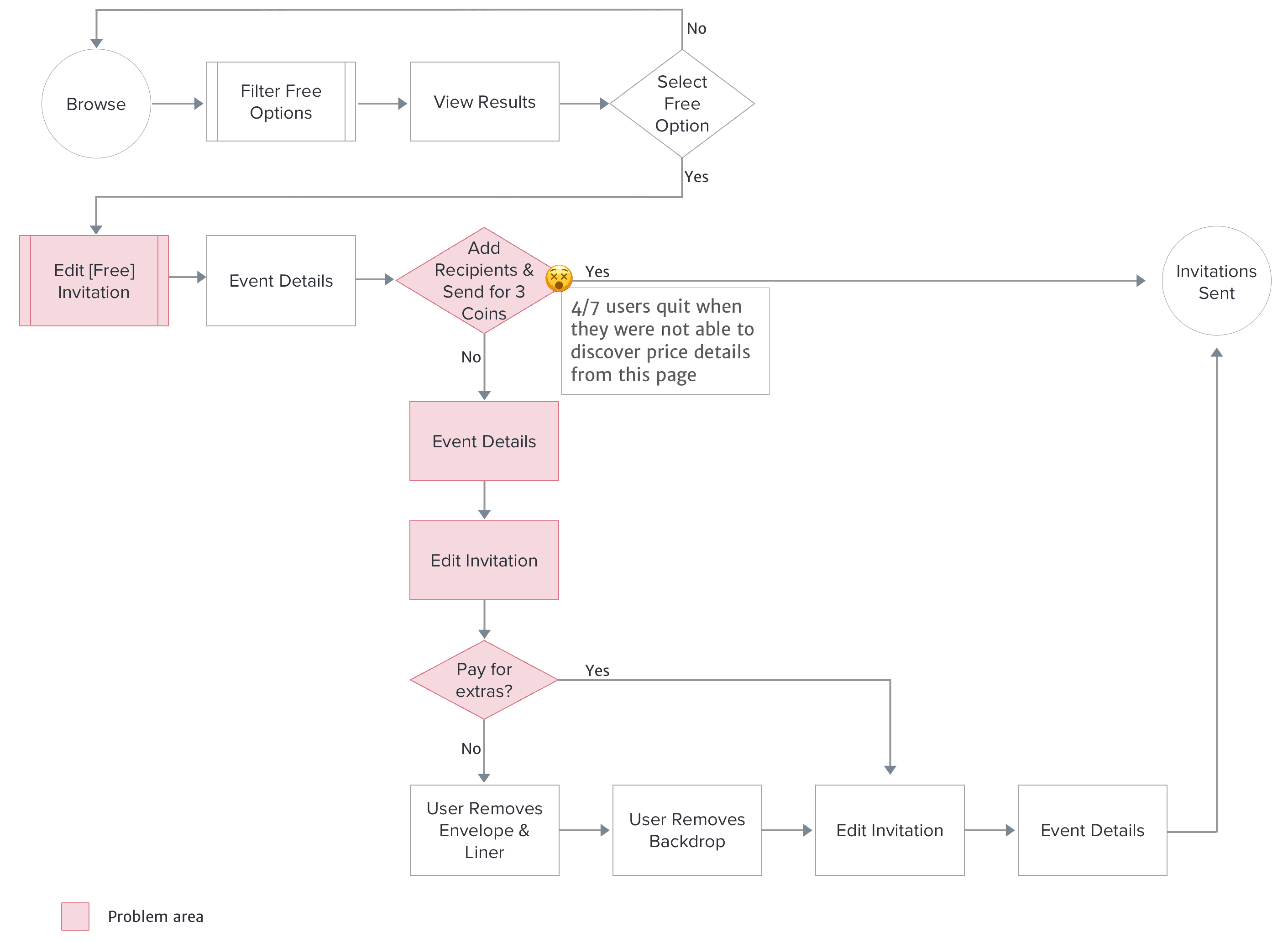
Current task flow
I re-designed the task flow to present premium options in a screen of their own early-on in the task flow:

Re-designed task flow
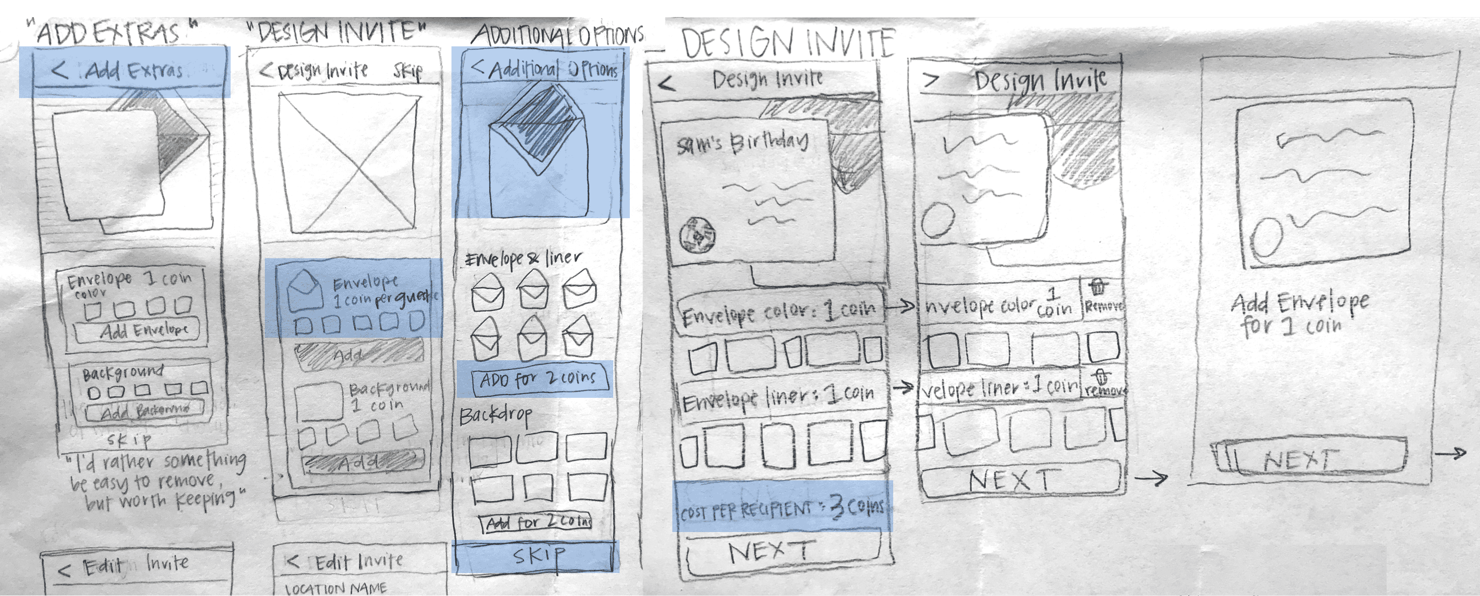
Sketches
I explored several options for the wording and UI of my redesign. Highlighted in blue are the options I decided to use. I decided to place the “skip” button at the bottom of “Add Extras” screen so that users would scroll through and see the premium options they could add. I titled the screen with premium options “Add Extras,” so it would be clear to hosts that these are not added to their invitation already.
Prototyping & Validation
After getting some initial feedback on my sketches and user flow, I iterated on the design and created a prototype to test and validate the new solution with users. See the before and after comparison:
Making Price Discoverable

Edit Invitation Screen

Here are the results of my redesign when I tested with 7 users:
Key Takeaways
When a busy mom is planning a birthday party for her daughter and prioritizing her budget, it feels misleading to be charged for something she didn’t select and wasn’t aware of. Through both research and validation, I saw that my hypothesis to reduce the frustration by presenting premium options in a transparent way actually excited users to want to make a purchase.