Fireside
MVP | Responsive Web
I designed an MVP to find product/market fit, interviewed users to prioritize features for product roadmap, and tested the interactive prototype with users.
Overview
How it works
Fireside is a private social platform that facilitates meaningful conversations by sending everyone in a circle the same question to answer.
Challenge
Design a responsive web app MVP and identify target users.
Goals
My goal was to design a way for people to feel connected to each other and learn more about each other.
- Short-term: successful task completion through usability testing.
- Long-term: increase engagement with the product from alpha testers and user acquisition.
Design Preview
Research
Start with empathy
I interviewed 14 people to ask about how they use messaging platforms or discussion groups to connect. I asked for specific examples like:
“Tell me about the most recent conversation you had over a messaging platform that lasted longer than a few simple exchanges.”
Four types of users emerged. I chose to segment the users to focus on those who preferred writing their thoughts and asynchronous communication for the MVP.
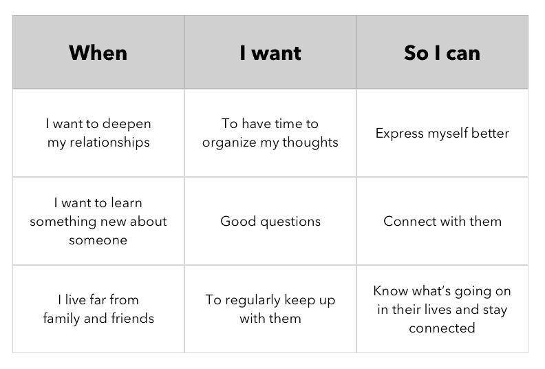
Job Stories
Framing the needs I found in terms of job stories helped me to map out key features to prioritize.
Competitive Analysis
I looked at existing design patterns from:
- Dating apps: how do they keep user engaged?
- Messaging apps: what patterns are users already familiar with?
- Meditation apps: how do they encourage thoughtfulness and set a “tone”?
- Finance apps: how do they build trust with sensitive information?

Explorations
Early Iterations
Each week, I tested my designs with a handful of potential Fireside users in order to get a better understanding of how they use social media to deepen connections, and to discover and correct usability issues early on.

I discovered a few recurring themes. People need:
- Quick access to all their circles
- Notifications so they don’t miss new activity
- Updates on the status of who has responded to a question
Designing for connection
Fireside needed to display updates and action-items to users once they logged in. How might users know what next action to take without feeling bombarded by notifications? The goal was to create something that felt simple and would cultivate a sense of connection between the people in circles.
Fireside was running alpha-testing over email, so I inherited a few constraints: no limits to the number of circles a user could join, and no limits on the number of people within a circle. Designing with these edge cases in mind, I explored directions for ways to minimize overwhelm through varying information density.
Exploration 1: Cards
PROS
- Each circle is split into a card
- Easy to see everything happening in one circle at a time
CONS
- Takes up a lot of screen real estate with information that isn’t necessarily actionable
- Users might miss notifications for circles further down
Exploration 2: List

PROS
- Information is split by necessary action to take
- Most recent questions to answer are at the top, followed by responses to read
- Encourages user action
CONS
- Doesn’t give users a sense of connection to the people in their circle
- Feels like a task management app
PROS
- Information is split by necessary action to take
- Most recent questions to answer are at the top, followed by responses to read
- Encourages user action
CONS
- Doesn’t give users a sense of connection to the people in their circle
- Could feel like a task management app
Exploration 2: List
Exploration 3: Scroll

PROS
- Highlights simplicity and the feeling of connection and space
- Shows one circle at a time
- Concentrates attention on only one action
CONS
- Circle avatars within a main circle looks messy
- Accessing other circles could easily be missed
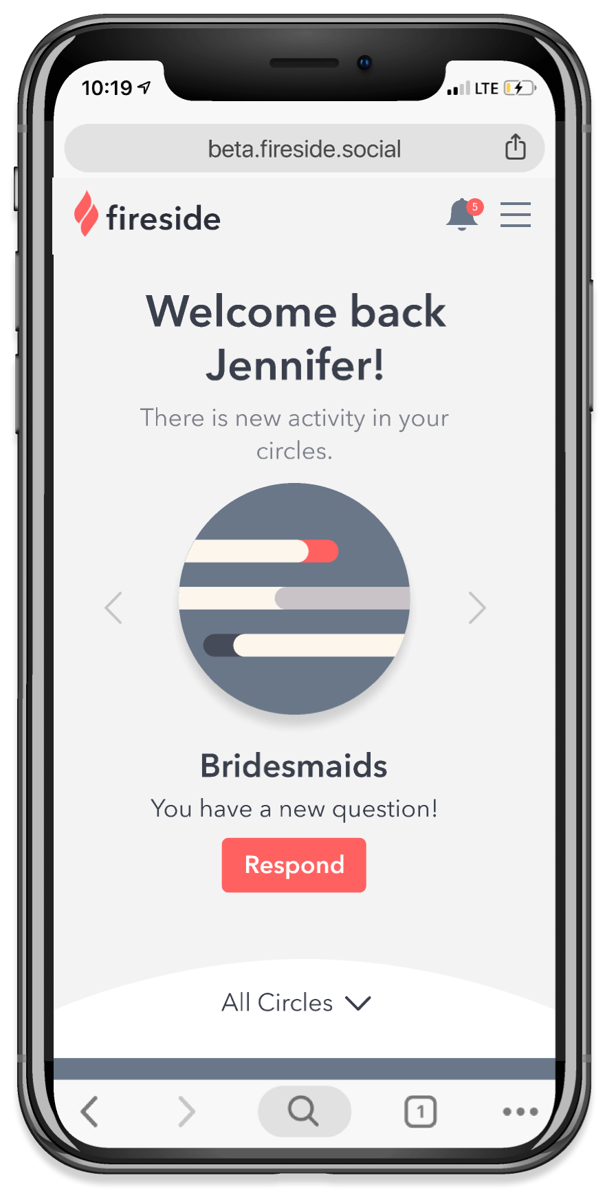
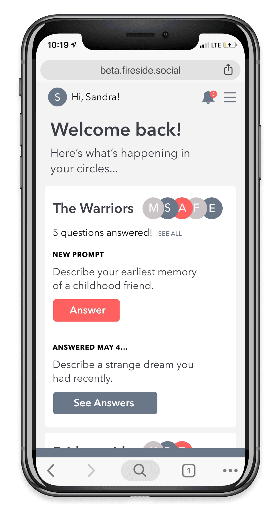
Final Design
I believe this design will better promote engagement with the app. It combines multiple views for a user to access their circles. I used avatars to represent whole circles, rather than using people’s individual avatars within a larger circle. I added left and right arrows to show affordances, knowing the swipe gesture familiar in native apps would not work as well for a web app.
Threads
Threads are where a user can see all the answers to questions they have responded to. I really wanted to concentrate attention on the answers, rather than the questions themselves. This design follows common social media patterns, like the line on the side to help your eye track which conversation you’re in.
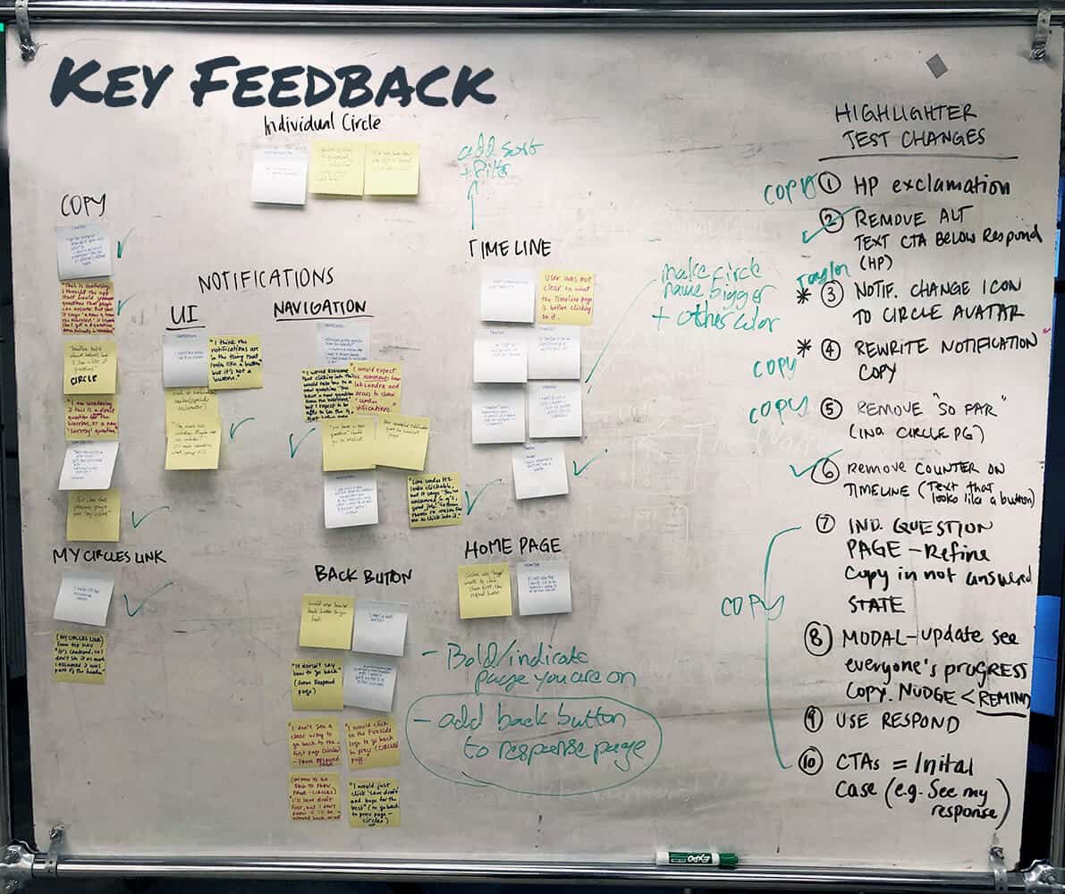
I made several changes after interviewing users about this page:
- Initially it was called “Timeline,” but zero users knew what to expect before clicking into the screen. Renaming it “Threads” more clearly communicated that you would find conversations here.
- The way information was ordered felt unclear. Adding a way to sort from a dropdown menu lets users decide how they want to view information.
- Adding a label—”Sort by”—to the dropdown shows clearer affordances.


Brand
The look and feel of Fireside were important for building trust and fostering a sense of thoughtfulness for users who are sharing their stories. I created avatars to represent a user’s circles, but ultimately help the content—the conversations—to shine. The color palette has appropriate contrast for accessibility standards and conveys a sense of warmth. The outcome was simple and warm, like a fireside chat.

Final Design
Mobile version
I designed mobile first, as users would primarily access Fireside on their phones. I tested these final designs in an interactive prototype with 9 users for success and efficiency in a usability test. 9/9 users successfully responded to a question.

Reflections
For the next version of this app, I would explore features for a premium version. Some ideas I had were:
- Creating your own questions or browsing a catalog of questions by category
- Integrating ways to continue conversations in-person, like possibly a trip-planner
- Adding tags to questions and responses to make them more findable
- Saving answers to “My Biography” or offline connections
It would be interesting to further dive into the core value initial users get from this app—whether it’s a way to augment in-person relationships and drive people to have more offline connections, or if people love the story-telling aspect of sharing their answers and recording those for years down the road.